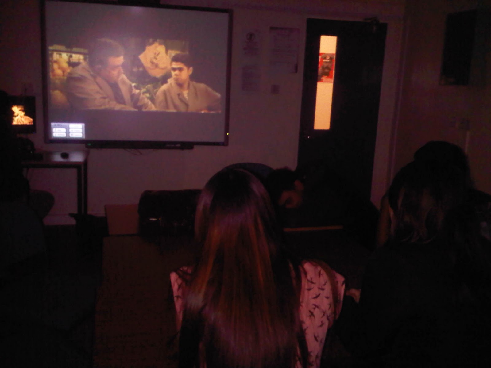
Final trailer
Monday, 26 March 2012


Thursday, 22 March 2012
Mary Kelly Q4 - How did you use media technologies in the construction and research, planning and evaluating stages.
Mary Kelly - How did you use media technologies in the construction and research, planning and evaluating stages
Planning -
The main media technology we used in the planning stage of our product was Blogger for the evaluation and marking of our work, it was a very useful tool to help us plan all our ideas in one space and build a development time line to help us plan for the next step. Another useful aspect was that all of the members of our group were able to contribute and look at each others ideas via their posts, meaning that we were all constantly up to date with the latest developments. Another useful media technology was the program Google Earth, a downloaded software in which we were able to plan our location shots. Using the Street View application which enables you to view roads at grond level. We looked at some location shots and with street view decided whether they were suitable or not. Click Here for a link to previous post on Google Maps. To share physical notes or planning we had done, for example Click Here for previous post where we used an scanner to share our story board. Also for our first questionnaire we used Microsoft Excelle to input information and produce graphs, Click Here to view graphs we produced from this technology. This was a very slow process so we decided to find another media technology that was more efficient. So for our final Questionnaire we used Google Docs a program that allows you to easily create questionnaires, share them, produce spreadsheets from the information and produce graphs with the information. We found this dramatically reduced the duration time of this process, Click Here for previous post on Google Docs.

Research-
The main element of media technology we used in the research stage of the creation on our media piece was the internet with the many different services it provides. The most useful part of the internet is that it is very quick and accessible and holds a extremely large amount of information that you possibly wouldn't be able to find if you were searching manually. We used a large amount of websites, collecting information for research, some of these includes The Little White Lies website, the Empire website, the Get Ahead OCR MEDIA website, the BBFC website, the Glossary of Film Terms website and the IMDB website. These were all extremely helpful in the research stage of our production, which we couldn't have done without the use of the internet. Another very useful aspect of the internet was Youtube , which in itself is a very comprehensive and vast video database. This meant we were able to access many trailers and clips of films for the research and development of our own work. All of these aspects meant we could examine real life media products in more detail, which is something that was extremely important in the research stage of this film. For example of usage Click Here for previous post where we were able to use google to research special effects.


Construction -
We used a large range of different media technologies in the Construction stage of our production. For the editing stage we used a simple to use editing software IMovie’11, Click Here for previous post on editing on IMovie. For our soundtrack, we used the program Garageband'11, again, a simple to use software that allows the user to create a piece of music with either recording their own interments or using the pre loaded loops. We used both of these functions when creating our own soundtrack, the recording function to record the voice over and to record a simple melody using the digital piano and adding an synthesizer effect to it, and we used the pre loaded loops to add other aspects such as the drum bass. Click Here for previous post on using the software Garageband. For the shooting of our trailer we used an JVC Everio, a member of our groups camera, this was a much lower quality that the school's HD camera but because of insurance reasons we weren't allow to take these cameras outside school. As this would limit our production we decided to use our own camera so we had more locations to choose from. In the production of our ancillary texts we used the Abode software Photoshop and Illustrator, as I have experience using these softwares, we able to create something that was specific to our vision. We used Photoshop for the creation of the poster because its functions were best suited for this design, I used tools like layers to work in the tube line background. We used Illustrator for the magazine cover, because this application is better suited for working with text and shapes/structure which was needed in the design on the cover. Click Here to see previous post on our production on photoshop and illustrator. Another technology we used for the construction of our ancillary text, was font database DaFont. As photoshop and illustrator had a limited range of fonts, we used this website for a larger range. Click Here for previous post on our use of this website. Another website we used in the construction/promotion of our website was the social networking site Facebook, as we created a facebook fan page to promote the film. Click Here for link to previous post on facebook group.
Mary Kelly Q3 - What have you learned from your audience feedback?
Question 3
Mary Kelly - What have you learned from your audience feedback
After deciding what area we wanted to go for with our trailer we did some market research, handing out questionnaires with a selection of questions to help us evaluate what would best suit our audience to help make it profitably and successful, Click Here to see previous post with the results of the questioner. We already decided our film would be an independent film, targeted at this niche audience, so we took into account that some of the answers might not be completely accurate for our specific audience, as the majority of people will be more familiar with mainstream films. Although when we collected in the information it appeared that most people selected independent films as their preferred type opposed to mainstream, so this was a useful aspect to more accurately cater for our audience. One of the questions we asked was how do they find out about films, and the majority of people said they find out about them via social networking. Learning this new information we decided that we would use this idea to promote our film, creating a facebook page (as the leading social networking site). Click Here for link to previous post on facebook page. Another result was that we learnt from the questionnaire that the most preferred music genre was Pop, so creating the soundtrack to the trailer we tried to add Pop like aspects/themes, such as synthetic sliding notes and an upbeat rhythm. We also learnt that the most preferred genres of film were Drama and Psychological Thrillers, and although we didn't want to be completely bound by genre conventions, we added some aspects from each of these.

For this questionnaire we also gave some real media examples of film magazines and film posters and asked which was more memorable and their favorite. The results were that the most memorable magazine cover was an independent film magazine, 'Little White Lies'. So from this, we decided to create an independent film magazine design. But for the film poster, most people chose the mainstream poster designs as their favorite. This information meant we would add mainstream poster influences to the design on our piece. Concerning magazine cover's, we also found out that Imagery was regarded to be an aspect that makes the design most effective, from this we would include an very strong image within the layout.
 To understand what aspects of trailers people like fully, we assembled an small focus group along with giving out the questionnaires. This was useful as we were able to obtain information face to face with our audience so that we could learn specifically what we needed to know. Click Here to see previous post on the focus group.
 Before the final cut of our trailer, we wanted to learn more from our audience about what the last adjustments we needed to make were. We also wanted to learn more information to decide whether our product has been successful in portraying an independent film rather than a mainstream one. So we created a final questionnaire using an program called 'Google Docs' and easy to use software that helps you create questionnaires and collect the information easily. Click Here to see our questionnaire. From the results of the questionnaire we found that we have succeeded in the sense that we received high rating for the trailer and most people thought our film was aimed for an independent audience. Click Here to see previous post on the results, this information gave us confidence in completing the trailer. Click Here to see previous post on the creation of the Final Questionnaire.
Monday, 19 March 2012
Mary Kelly Q2 - How effective is this combination of your main product and ancillary texts?
Question 2
Mary Kelly - How effective is this combination of your main product and ancillary texts?
We decided through our main product and ancillary texts we wanted to create an independent product package aimed at a niche audience. One of the ways we portrayed this within the magazine cover was by challenging and subverting magazine layout conventions, from the more traditional and mainstream film magazine look.
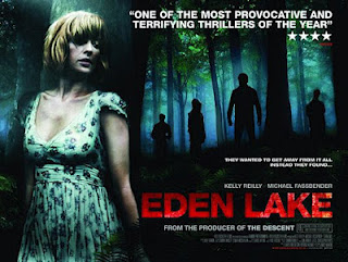
For the poster we went for a more mainstream look. We looked at other independent films that had been successful with a mainstream audience market and found that they had been promoted, to an extent, mainstream film style. For example the film Eden Lake 2009 a British Thriller which was reasonably successful in the box office, this film's poster aims for an mainstream Thriller audience. See image of poster bellow. So we went for a similar route although still retaining the fact that it's an independent film.

Through out the main product and ancillary texts we wanted to have the themes of the films narrative to be expressed. These themes include the aspects of Drama/Philological Thriller genre, the character driven narrative, the urban setting of the film and the intimacy between audience and main character. These themes are expressed in the trailer (our main product) by use of the voice over at the beginning and with the main character talking directly to the audience in an intimate fashion. Also with a series of close up shots and the focus of the shots being based around him, these all give a sense of intimacy. The mix of long shot of urban landscapes introduces the theme of the urban setting. These themes are represented through the magazine cover, with the use of the extreme close up image of the main character presenting a sense of intimacy and focus on him. And these themes are represented through the poster with again the use of the close up image of the main character, also the background image is made usinga tube map suggesting the idea of an urban setting more specifically in London. The philological thriller genre is expressed in the poster through the use of a dark background and harsh lighting on the figure.
We also implemented more simple aspects to link our main product to the ancillary texts, to make the combination more effective. These include a similar colour scheme running through the texts, along with a similar font style. We also mentioned one of our ancillary texts within our trailer, as we decided that within the trailer we would add an title slide with a quote from an article from our film magazine 'Click'. Another way we linked our main product to ancillary texts is that on our magazine cover, we decided to make it an 'Existence issue' which is something independent film magazines often do with successful films, dedicating the magazine to review the film. Also adding a quote from Finlay McGow the actor of the main character of our film, and quote him as being an "rising star" promoting the film even more. All of these small aspects result in a very effective product package in which the ancillary texts support the main product in good effect. We also implimented an House Style through the main and ancillary texts, so that each product is related. Some example of these house styles includes the use of a colour pallet, this colour pallet of black and shades of orange.
Mary Kelly Q1 - In what way does your media product use ,develop or challenge conventions of real media products.
Question 1
Mary Kelly -- In what way does your media product use, develop or challenge conventions of real media products..
Form- Trailer, Film Magazine Cover, Film Poster
Genre-Hybrid of Drama and Psychological Thriller
Our narrative is based around one characters journey, through his hardship of his uninteresting life as he feels his life is slipping into the urban sprawl around him... Then he suddenly wakes up to finds himself full of motivation to change his life and make a difference to the world around him. The films follows this journey as our hero strives and struggles to change.
After examining Adorno and Horkheimers' argument on standardization, we decided to organise our film around this concept. As we agreed that most films have disintegrated into this idea of standardization, so we wanted to create something that didn't fit into this category. So we tried not to be defined by any previous genres. This was made possible with our choice of creating a independent product package, as through this we weren't limited to mainstream conventions and therefore, the pressure of a purely profitable outcome. We did decide to use the main ideas from a western narrative, depicting a typica or generic problem being resolved but we tried to approach this in a different direction. We decided to only define a value idea of the reason for the problem being resolved, not specifically define why or how. We also resolved the problem near the beginning of the film, this alteration of the usual conclusion at the end gave us the means to experiment. A film that similarly plays with the idea of an conventional western narrative is ‘Memento (2000)', this film uses the traditional idea of resolution on a character but alters it, playing the scenes in a different order creating this confusing narrative where the audience begin the film with the last scene, click here for link to begging sequence to 'Memento'. And although Memento takes a very different approach to this idea, its still subverting natural conventions of narrative which is something that we were interested in. We also look at films that use the ‘Mumblecore’ genre which completely eradicate narrative conventions, for example ‘Slacker 1991’ an independent American film which follows an group of misfits. Through the Mumblecore genre, directors have cast the actors for the characters and left them to their own accords, which is an extreme way of rebelling against narrative conventions. And, although we wanted to challenge conventions of narrative like Slacker, we couldn't completely subvert them because for the exam we needed to show an understanding of narrative conventions.
Genre -
As I noted before we didn't want to be bound or restricted by many previously stated conventions. So in relation to genre we didn't create the film bound by an specific genre format. But if you were to categorise the film it would probably fit into the Drama/Physiological Thriller area, as the narrative/mise en scene and other areas share simliar aspects. Some conventions that are used in Drama's and Physiological Thrillers include the narrative following one character. We had already looked at successful films that had challenged this idea of genre conventions, for example ‘Limitless (2011)’a film where the narrative is so unique that it's hard to classify it to one genre. One article By Rebecca Murray (About.com Film Review Journalist) calls it an "an impressive, engaging, and entertaining genre-defying film".
Special Effects -
We were limited to the usage of Special Effects on our post production of the trailer, as we only had access to IMovie software. So this was an area of our production we felt could of improved, with access to more advanced editing applications. But we were able to alter visual effects using what we had available. Effects like saturation and contrast, and added some pre setting effects such as 'Heat Wave'. Two visual examples bello. We used these effects to separate two sections of the film, using the warm tone and high saturation/contrast effect Heat Wave to represent an positive change and a cooler tone and desaturation to represent more depressing atmosphere. This is again compares to the effects created in 'Limitless', click here to see my previous post about the relation between our trailer and 'Limitless'. Also to link our trailer to real media products we added text slides quoting from newspapers like 'The Guardian' which is well known for its independent film reviews, and it is usual for independent and mainstream films to promote their films through film reviews. An example of this is within the trailer for 'Let The Right One In' a successful Swedish independent film, Click Here to see trailer.

Camera Work –
We used a standard mix of conventional camera work for an independent film, for example handheld, panning shot, mid, long and close up shots. We also used a large mix of long landscape shots and close up/mid shots of our actor, this mix is to give a feel of the urban landscape/setting of our film as its an important factor. We didn't want to alter/challenge the conventional use of camera work, as we felt these traditional techniques do not impose a mainstream film effect these are simply used for effectiveness.
Sound –
For our trailer we only wanted non diegetic sounds, these included a base soundtrack and a narrative voice over. This being the general format of trailers, as we didn't want to challenge the traditional format of a trailer. This is because we wanted it to be recognizable as a trailer, also for this exam we needed to show an understanding of conventions so subverting them too much would possibly lose us marks. For the actual soundtrack, we needed to create an original piece without breaching any copyright laws. This creation of an original piece gave us the freedom to develop something that was totally unique and perfect suited to what we wanted, however learning complicated new software packages was a challenge so we made do with GarageBand, which was reasonably easy to use. For further information on our use of Garageband and the process of creating our soundtrack, Click Here for our previous post on Garageband. Our aim for the soundtrack was to only create an intense atmosphere, so that the music itself isn't particularly payed any attention to. For this we used the idea of repetition and long notes, this is an convention shared with other independent film trailers. For example the video bellow is the trailer of an independent film called 'Sleeping Beauty', through this there is an constant receptive flow of unnerving music with an non diegetic voice over carrying along it.
Mise En Scene -
As we created an independent film Mise En Scene was very important, and was one of the first things we wanted to look at in relation to creating the trailer. We wanted it to be representative of general urban life, and we created this with the setting and atmosphere. The setting of the film is quite conventional for an independent film, especially within the genre Drama and Phychological Thrillers which are two genres that closely link to ours. For example setting is hugely important for the film 'Lost In Translation', 2003 as the director, like us, wanted the feeling to be busy and to isolate the characters as individuals away from the urban landscape, Click Here to view one of the scenes from Lost In Translation that portrays this effect.

Form Type - Magazine Cover
As we decided to create an independent film, the natural step for creating a magazine was to make it an independent film magazine. Like our trailer we wanted to subvert many conventions of magazine covers, this gave us freedom to experiment with many different designs. Although we had to stick with the main traditional conventions, for example the size, shape, the main title, quotes and subheading, this was to still make it recognizable as an magazine. We looked at the independent film magazine 'Little White Lies' as inspiration, as its a really interesting layout challenging many conventions of traditional film magazines. The main idea from this magazines design was to be simplistic and non busy which it much the opposite to more mainstream film magazine covers for example Empire film magazine. Click here for link to previous post on Empire and Little White Lies product research. So from this we decided to alter some aspects of our design to develop traditional aspects of film magazines. For example we decided to place the main heading of the magazine at the bottom unlike most magazines, this alteration is simple but makes a big effect on the overall look of the design. We also did use the conventional use of one main character on the front, but unlike most designs we used an extreme close up where as most images on magazine covers are full and mid boy length shots. Most mainstream designs main aim is to make the design stand out, they achieve this by using bold colourful images and text. As we wanted to challenge these conventions we used a limited rance of pastel colour, and make the image black and white creating a much more calm feel to the design. Another interesting aspect to the magazine Little White Lies was that it is only sold online, we liked this idea and used it with our cover, emphasizing it with the lack of an bar code and the advertisement of ordering it online. With the idea of inclusively being ordered online, this meant we could place the heading at the bottom because if it was sold in shops the title would not be seen because of the display stacking. We also decided we would make the magazine an 'Existence Issue', as we saw in independent film magazines like 'Little White Lies' this was an regular occurrence this was a useful convention for us to link our main product with our ancillary texts. The name of the magazine 'Click' is conventional to mainstream magazines, in the sense that its short and related to the film industry, such as , 'TotalFilm' and 'Entertainment. We wanted to make it slightly conventional to make it recognisable as an film magazine, too see the previous post on the choice of our magazine name Click Here.
Form Type - Film Poster
Our film poster has a more conventional feel than the other two texts, as we felt to successfully promote our film we needed to reach out to a wider audience. So adding more Film Poster conventions we are appealing more to an mainstream audience. Some of the classic conventions include the black background creating an intense atmospheric effect, an example of this is the 'Secret Window' 2004 poster see bellow. Also the use of the the singluar character is classic for a Drama/Phycological Thriller poster because of the main focus of the film, for example the 'Precious' 2009 posterwhich features only the main character. To express the idea that its an independent film rather than mainstream, the only name we included in the design is the directors. This is unconventional of an mainstream poster as the attention is usual on the main actors, an example of an film that uses the directors name to promote the film is 'Kill Bill' 2003 directed by Quentin Taratino famously known for producing successful films. See poster bellow. Although we didn't want to clutter the design of the poster we had to add an age certificate to it, so we decided on an rating an 12 certificate. Click Here to see previous post on our on the age certificate. Although necessary this is an conventional aspect to the promotion of film, we needed to add it to show an understanding of conventions. Its conventional of a film to have an 'tagline' and as we wanted to subvert conventions we wanted to create an tagline which is very unique. We found this useful website that had the 'Great Film Tag Lines' this help us with ideas and to avoid cliche or over used lines, Click Herefor previous post on our Tag Line Selection .


Subscribe to:
Posts (Atom)